This guide explains how to create icons for Mini Apps, including design requirements, sizing, formatting, and best practices to ensure a consistent appearance and optimal display across the platform.
| Spec | Value | Descriptions | Reference |
|---|---|---|---|
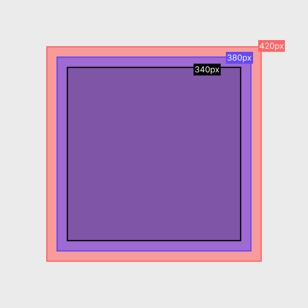
| Artboard | 600 × 600 px | Design the icon on a 600 × 600 px artboard. | 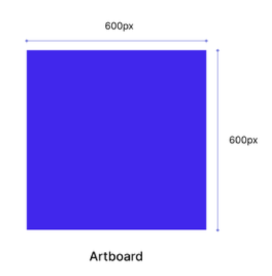 |
| Padding | 90 px | Maintain 90 px padding on all four sides of the icon. | 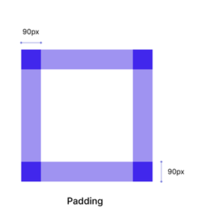 |
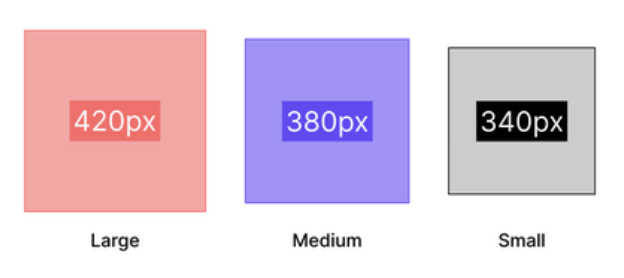
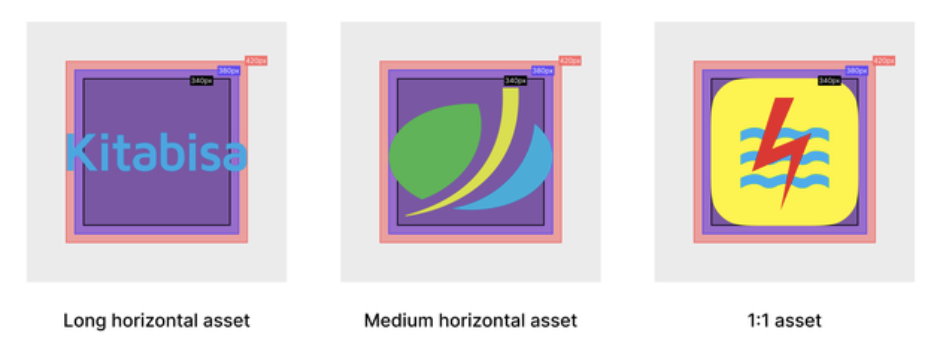
| Safe Area | 420 × 420 px | Keep all essential logo elements within the 420 × 420 px safe area to prevent clipping. Use the Large safe area for horizontal logos. Use the Medium safe area for vertical logos. Use the Small safe area for square (1:1) logos. |
|
| Square Logo Use Case (1:1) | 80px radius | Applies only to square (1:1) logos. Before exporting, apply an 80 px corner radius to the image. | 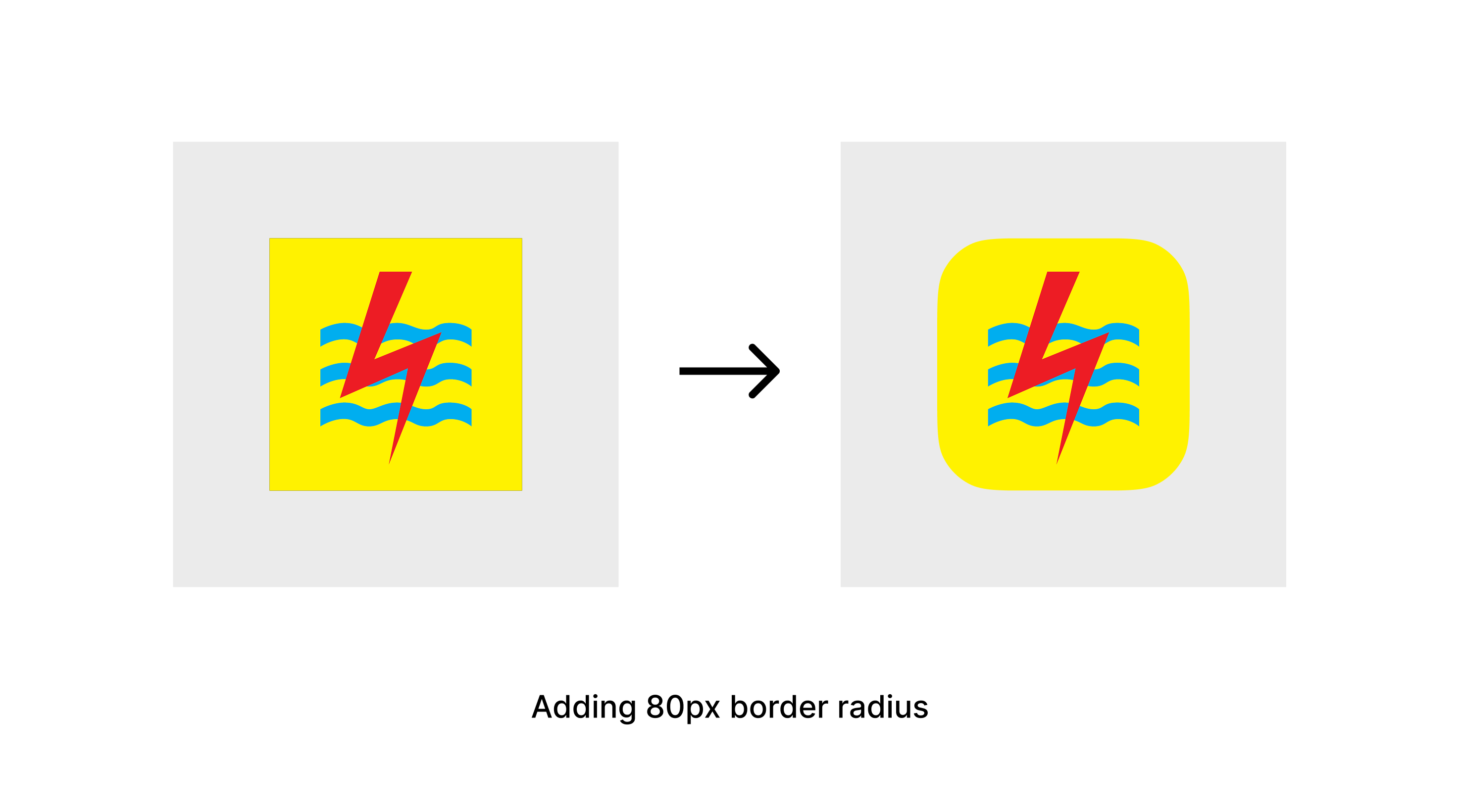 |
| Optional (Dark Logos) | Add a container behind the logo. Container size: 440 × 440 px. Corner radius: 80 px. | Recommended for logos that are difficult to distinguish against dark backgrounds. Place the logo inside a 440 × 440 px container with an 80 px corner radius. | 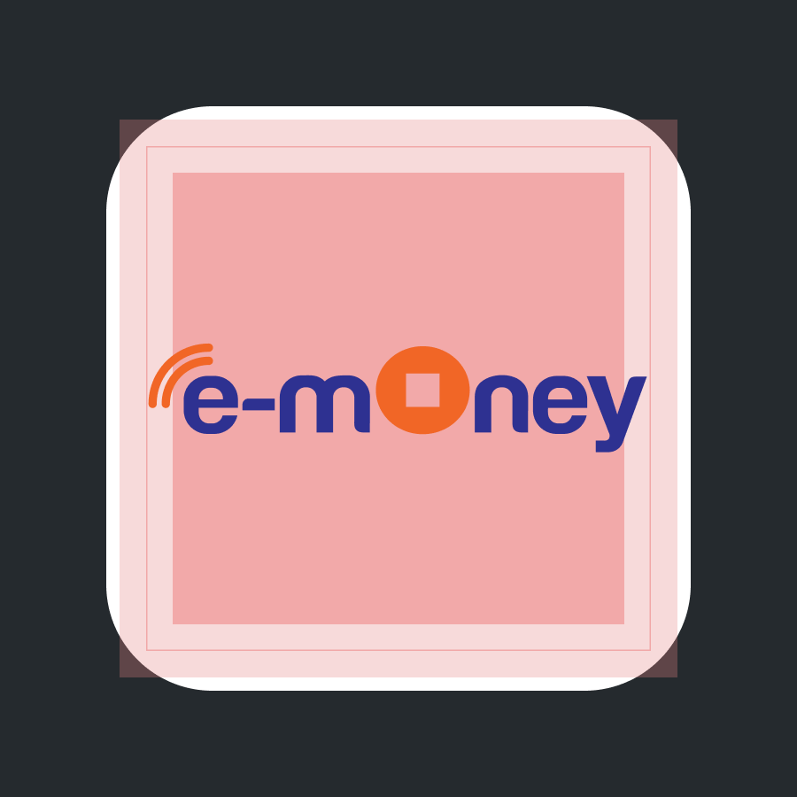 |
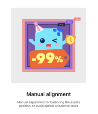
| Optional (Badges) | Add a badge when applicable | Add a badge when required. Follow the reference examples for badge placement and sizing to ensure consistency. | 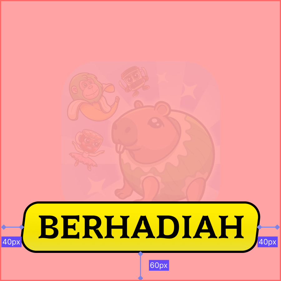  |
| Background | Transparent (No Background Fill) *Mandatory | The exported asset must have a transparent background. | |
| Format | .PNG (static - default) / .lottie (animated - optional) | Use PNG for static icons. Animated icons may be provided in .lottie format if supported. | |
| Export | Export as 1.5× PNG | Export the icon as a 1.5× PNG. | |
| Compress | Compress using TinyPNG | Compress the exported PNG using https://tinypng.com/ to reduce file size while maintaining image quality. |